Plot Panel
The Plot Panel draws your signals as interactive time-series charts, with zooming, a shared cursor, and a measurement tool.
Overview
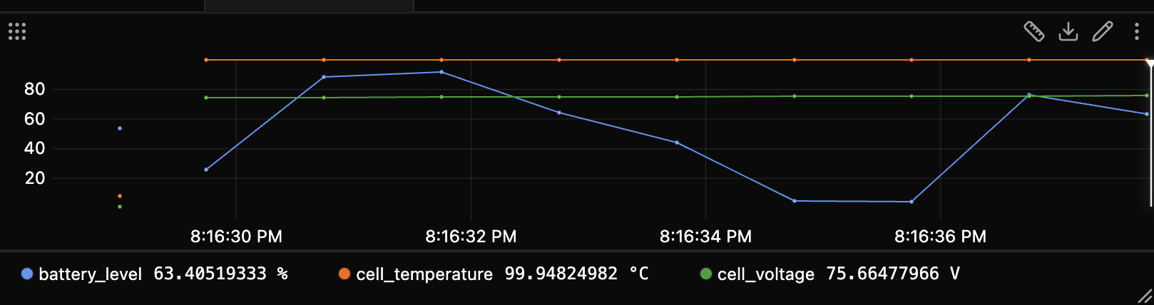
Signals are drawn as lines with time on the x-axis and value on the y-axis. Each signal gets its own color and can be hidden individually, and the panel handles both live streaming and recorded data.
Basic usage
Adding signals
Drag signals from the Explorer onto the plot. Each one becomes a colored line with a legend chip.
Navigation
- Left-drag to select a time range and zoom into it
- Double-click to step back through zoom history
- Right-click to put the shared timeline cursor at that time
- Hover to read the nearest values in a tooltip
Signal chips
Each resolved series or source in the panel gets a chip in the legend.
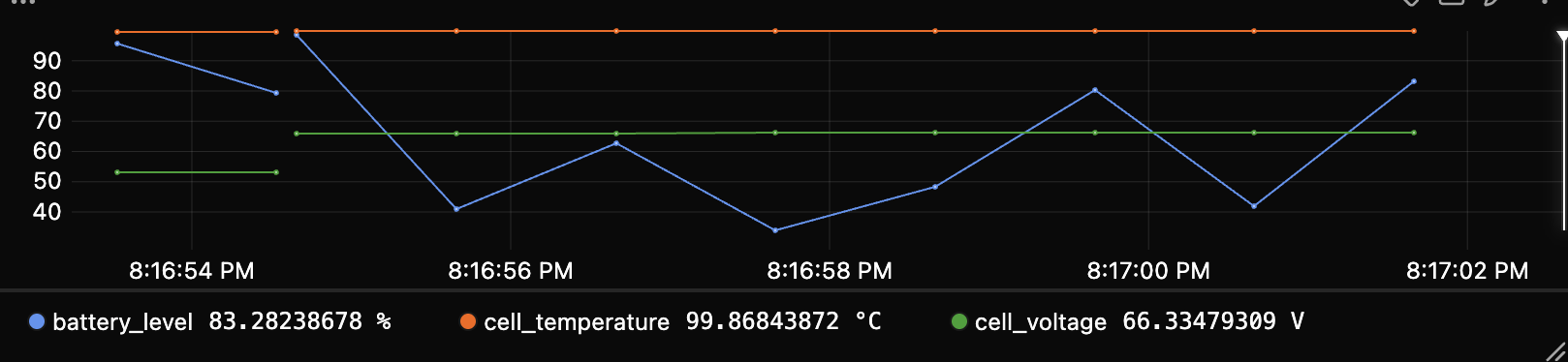
- Click a chip to hide or show its line. Hidden chips draw a hollow dot.
- Hover a chip to bring its line forward and fade the others, which helps pick one signal out of a crowded plot.
- Click the color dot to recolor the signal (see Colors).
- Click the X to remove the signal from the panel.
- Drag a chip to another panel to move the signal there.
- A muted chip means the signal has no data in view (see Show empty signals).
Show empty signals
Edit Panel → Config → Show empty signals (on by default) keeps a signal's chip even when it has no samples in view.
- On: the signal keeps a muted chip with no line drawn.
- Off: only signals with data in view appear in the legend.
Muted chips come in two kinds:
- Empty, plain muted. No samples in the current view; the tooltip reads No data in this time range. Scroll or zoom back over its data and it becomes colored again.
- Unavailable, muted with an unplug icon. The source is offline or the path was not found. The tooltip gives the reason, such as Source
robotdisconnected.
The default for new panels is set in Settings → Panels → Plot.
Colors
Click a chip's color dot to open the picker:
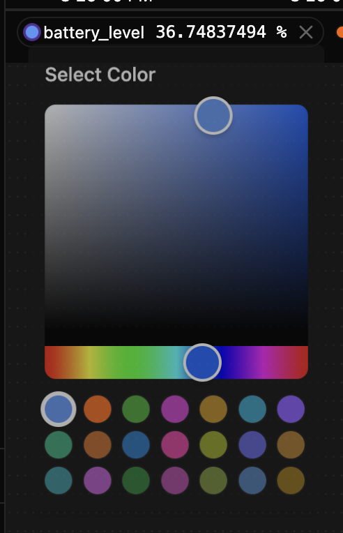
Colors are assigned per signal path and scope, then kept as you work:
- The swatch in Edit Panel → Data sets the signal definition's base color.
- A resolved chip's swatch sets that source's color override, whether the definition currently resolves to one source or several.
- When one signal spans multiple traces or agents, each scope keeps its own color so the sources stay distinguishable. Recoloring one does not recolor its siblings.
- After setting a scoped override, right-click that chip and choose Reset color to return it to its inherited base or automatic color.
- Stored colors survive editor open and close, tab switches, reloads, and saved layouts, as long as the signal binding still exists.
Appearance
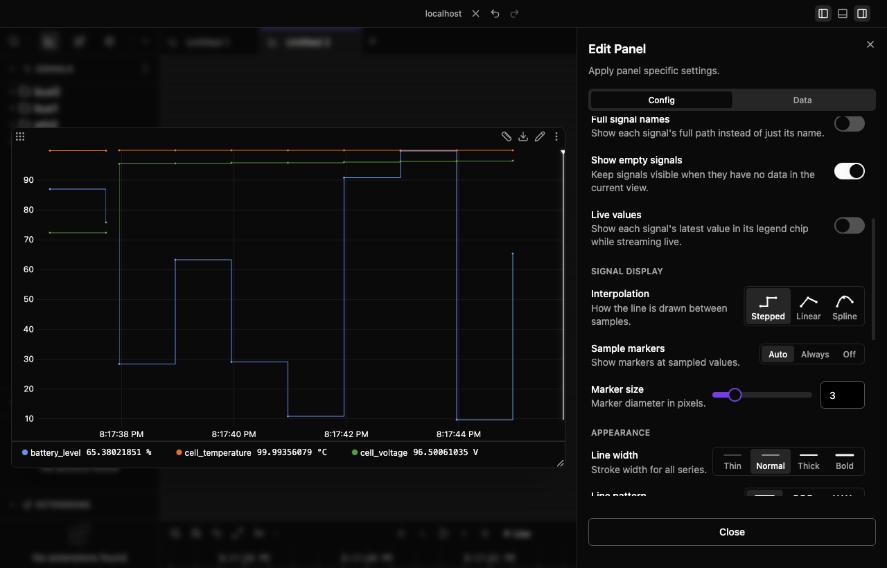
Every option below lives in Edit Panel → Config. Opening the Edit Panel expands the plot to fill the window beside the settings, so you can see each change as you make it. All of these apply to every series in the panel, and each has a default for new panels under Settings → Panels → Plot.
Interpolation
How the line is drawn between samples: Linear (default), Stepped, or Spline. Stepped is the honest choice for values that hold until they change, like a setpoint or a counter.
Sample markers
Show a dot at each real sample: Auto (default), Always, or Off. Marker size sets the diameter in pixels (default 3). Markers tell you where actual data is, which matters when samples are sparse and the line between them is interpolated.
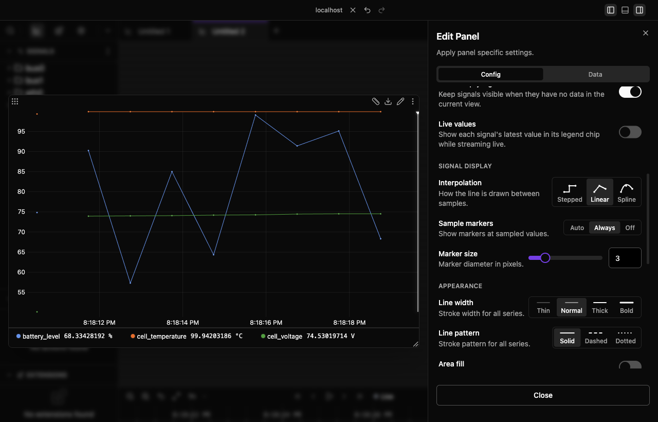
Line width
Stroke width for all series: Thin, Normal (default), Thick, or Bold.
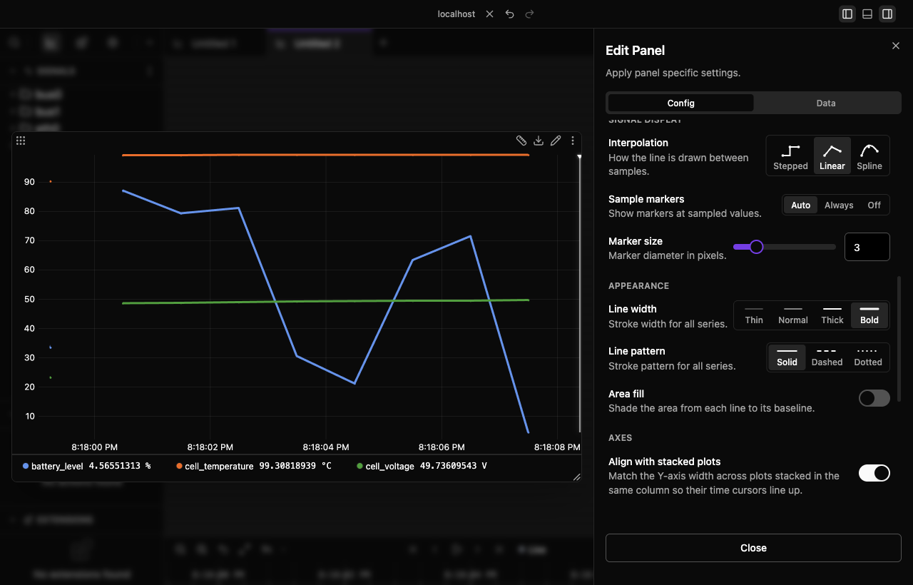
Line pattern
Stroke pattern for all series: Solid (default), Dashed, or Dotted.
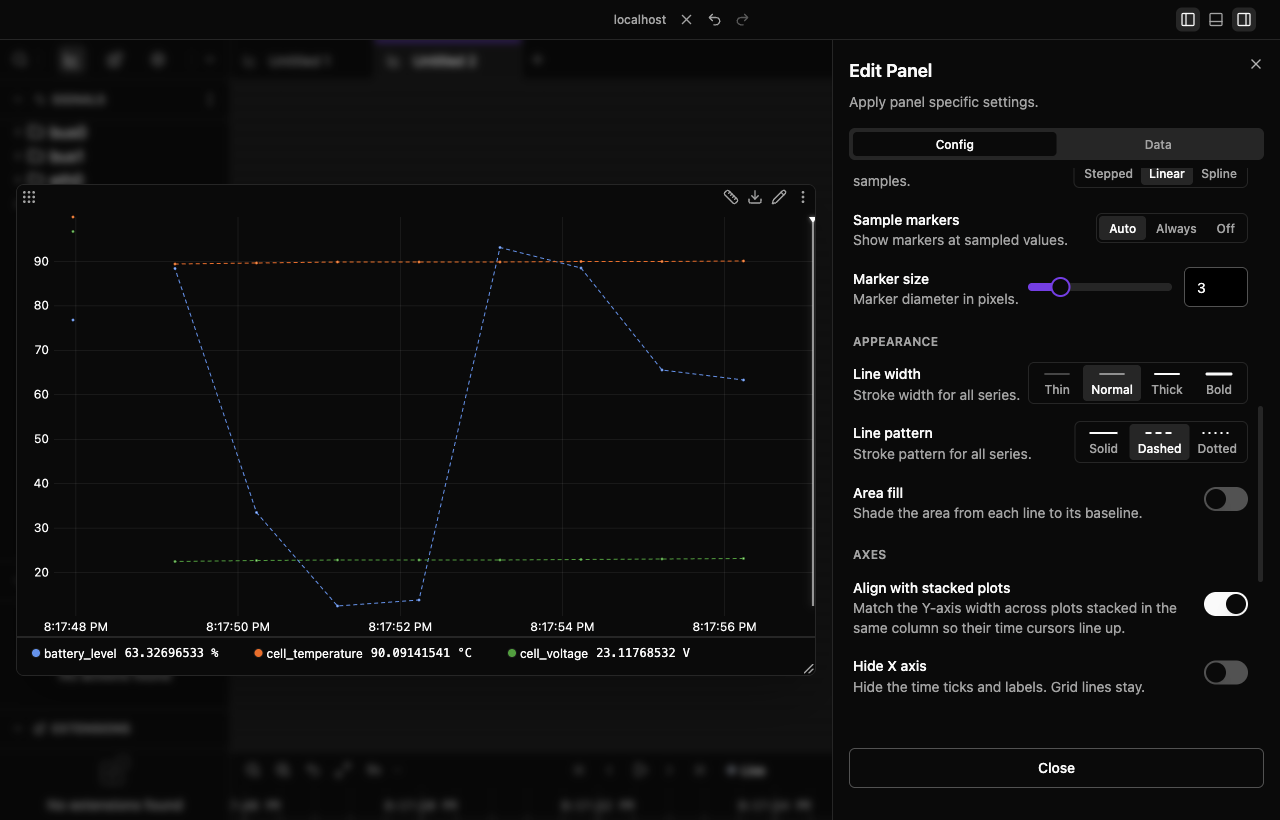
Area fill
Shade the area from each line down to its baseline. Off by default.
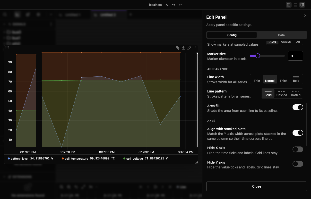
Axes
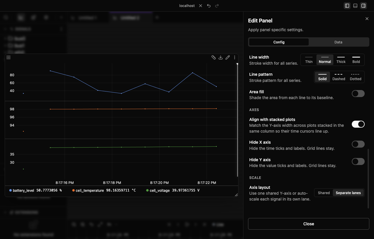
Axis layout
Choose whether signals share one y-axis or each get their own:
- Shared (default) puts every signal on one y-axis. Best when the signals have comparable ranges.
- Separate lanes gives each signal its own lane and auto-scales it there. Best when the ranges differ wildly, where a shared axis would flatten the small signals into a straight line.
Hide the X or Y axis
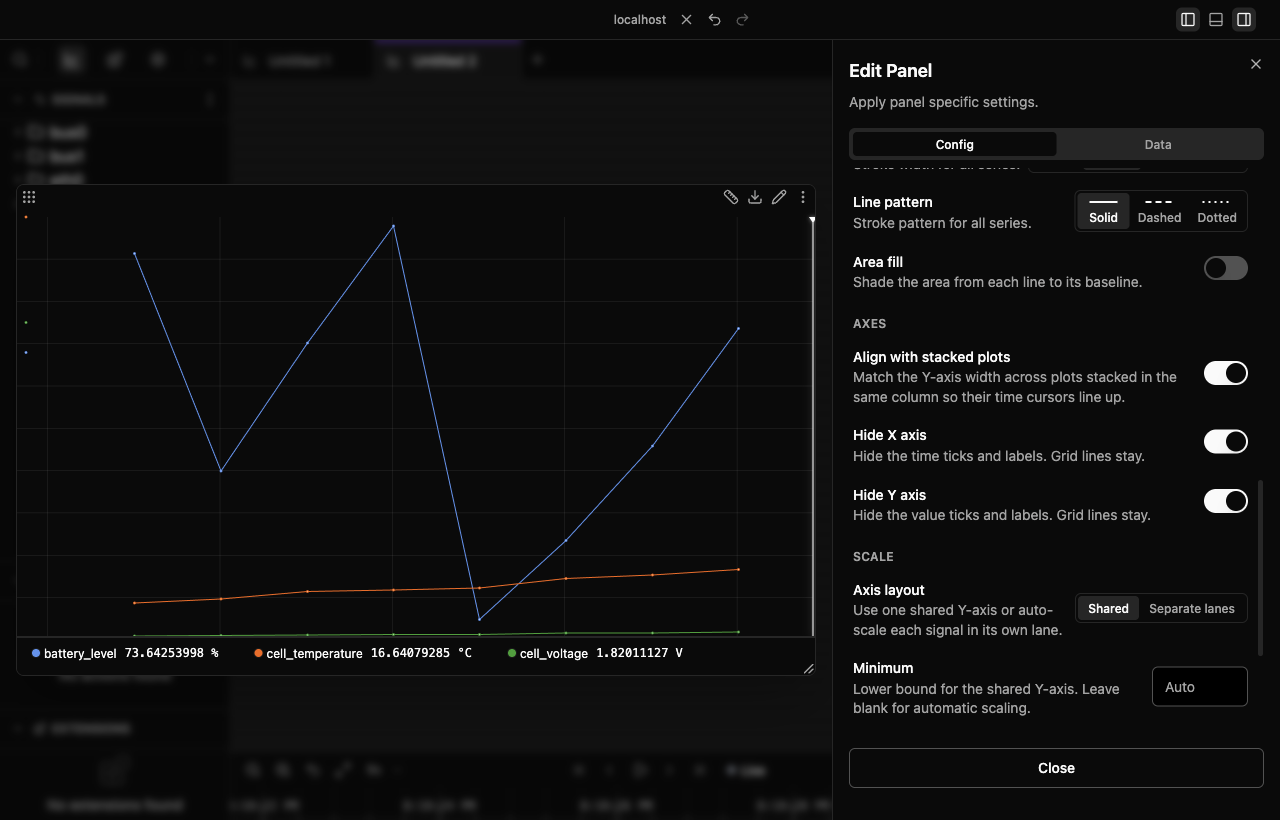
Hide X axis and Hide Y axis blank that axis's ticks and labels and give the space back to the chart. Grid lines stay either way. Both are off by default. Hiding the x-axis is most useful on stacked plots, where only the bottom plot needs to show time.
Align with stacked plots
On by default. Plots stacked in the same column match their y-axis width, so their plot areas start at the same x and the shared time cursor lines up straight down the column. Turn it off if you want a plot to use every pixel regardless of its neighbors.
Legend widths sync the same way across a column. Drag a legend's resize handle to set the width for the column, and double-click the handle to reset it.
Y-axis range
By default the plot auto-scales to fit the data. Set Minimum and Maximum under Scale to pin it instead, and optionally give the shared y-axis an Axis label.
| Min | Max | Behavior |
|---|---|---|
| Empty | Empty | Auto-scale to fit all data (default) |
0 |
Empty | Fixed bottom at 0, auto-scale top |
| Empty | 100 |
Auto-scale bottom, fixed top at 100 |
0 |
100 |
Fixed range from 0 to 100 |
Useful for holding a zero baseline, pinning a logic level (0 to 3.3), or giving several panels identical ranges so they can be compared. Clear both fields to go back to auto-scaling.
Legend layout
The legend can sit below the chart or beside it:
- Bottom, compact rows under the plot (default)
- Left or Right, a vertical list beside it
Set placement in Edit Panel → Config, along with Show legend. The legend has a resize handle so you can trade space between signal names and chart area.
Recording gaps
When a signal stops and later resumes, the line breaks at the gap rather than drawing a straight segment across it. A connecting line there would invent data that was never recorded.
Multi-trace plotting
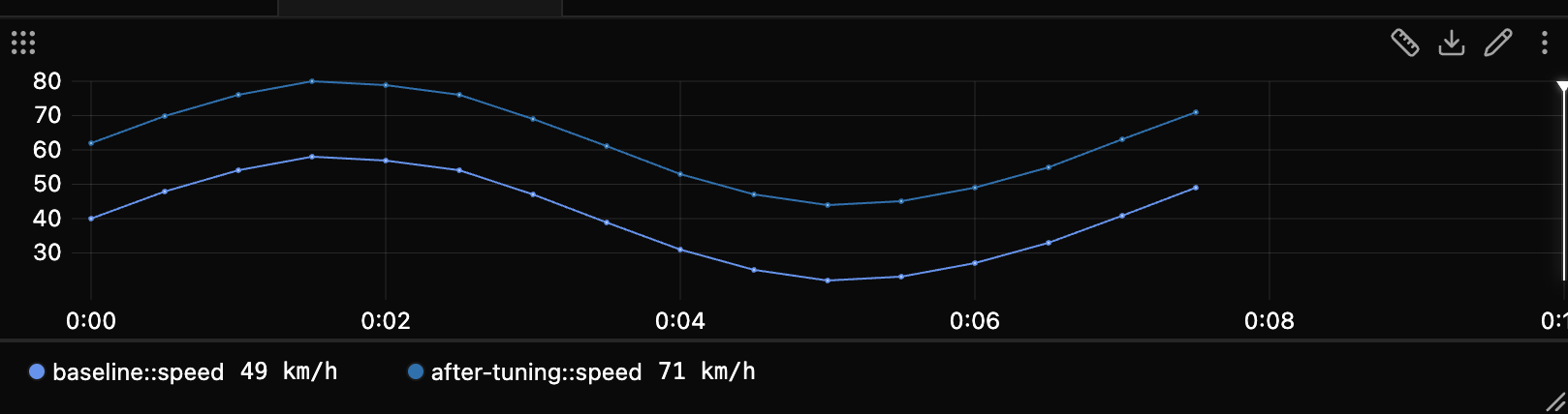
Put signals from more than one trace on the same plot to compare recordings. Each series is labeled with the trace it came from, and with the agent too when that is needed to tell them apart.
Timeline cursor
The plot shares the global timeline cursor with the table, value, log, and state panels.
Setting the cursor
Right-click anywhere in the plot to move the cursor there. In paused mode it moves in place; in live mode this pauses first, then sets the cursor. Every other timeline-aware panel follows.
Dragging the cursor
While paused, the plot draws a cursor handle. Drag it horizontally to scrub, and the global cursor updates as you go. The handle is hidden while playback is running.
Values in the legend
While paused, each chip shows its signal's value at the cursor. Pausing puts the cursor at the right edge of the view, so a readout appears immediately and then follows every scrub and jump.
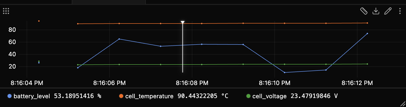
Values resolve the same way as the tooltip, to the value the signal held at the cursor. A — means there is no sample at or before the cursor. Hover a chip for the full value and its sample time.
In live mode, Edit Panel → Config → Live values (off by default) streams each signal's latest value into its chip instead. While the measurement tool is active, the chip shows the signed Δ between the two cursors instead.
Cursor lookup
Lookup is left-closest: values resolve to the nearest sample at or before the time, and if that point is null it backtracks to the nearest earlier non-null sample. This avoids misleading forward jumps when data is sparse.
Zoom and view history
- Drag-selecting a range commits a zoom step.
- Double-click steps back through the history.
- With no history left, live workspaces return to following live data and paused or trace workspaces return to their initial view.
- Starting a drag-select while playback is running stops playback first.
Display format
Right-click a resolved chip to change how that source's values read in the tooltip and the measurement tool: Default, Hex, Binary, Octal, or Scientific. The same menu copies the value or the signal path. Edit Panel → Data sets the signal definition's base format; use resolved chips for source-specific formats.
Formats are stored per panel and per series, so one signal can read 0xFF in one plot and 255 in another. Formats travel with the chip when you drag it to another panel, and survive reload and workspace save.
Hex, binary, and octal apply to integers directly. Integer-valued floats such as 42.0 use the short form (0x2A); other floats render the IEEE 754 bit pattern, so 3.14 becomes 0x40091EB851EB851F. Dictionary-encoded signals only support their labels, so the other formats are greyed out. If a signal has a value table, the label is kept alongside the raw value, as in Run (0x1).
Y-axis tick labels always stay in base 10. A plot usually mixes signals with different formats, and axis ticks land on values that would be meaningless as bit patterns, so the axis stays a shared reference scale.
Measurement tool
The measurement tool measures precisely between two points: value deltas, timing, and exact changes.
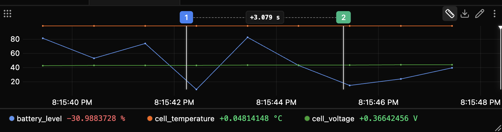
Turning it on
- Pause the view. The tool is disabled in live mode.
- Click the ruler icon in the panel header.
- Both cursors drop at once, at roughly 1/3 and 2/3 of the view, like an oscilloscope.
- Read the results in place: Δt as a bracket between the cursors, and each signal's change on its chip.
From there, drag either cursor to fine-tune. There is no separate click-to-place step.
Legend reveals itself
The per-signal deltas live in the legend, so a hidden legend is shown while you measure and hidden again when you switch the tool off.
Using the cursors
- Drag the cursor line, or drag the numbered label (1 or 2) for a bigger grab target.
- Cursors snap when a nearby sample falls within the on-screen snap threshold; otherwise they remain at the dragged time.
- Drag one past the other and they swap, so cursor 1 is always the earlier time.
- The hover tooltip keeps working while measuring, and is suppressed only while you drag.
Reading the results
Δt is drawn as a span bracket between the cursors, in auto-selected s/ms/µs/ns units.
Each visible signal reports its change Δ (end − start) on its own chip, signed and colored, green for an increase and red for a decrease. In a left or right legend the Δ is a value column beside the name; in a bottom legend it is inline on the pill. Hover a chip for that signal's exact start and end values.
Values use the same formatter as the tooltip, including your per-series display format, units, and value-table labels. The Δ itself is purely numeric and signed: it keeps the unit but drops value-table labels, since the change between two labels is not itself a label.
Visible signals only
Only visible signals get a Δ. Signals hidden via their chip show none.
Timestamps are nanosecond precision and values keep their original precision. Values at each cursor use the nearest valid sample at or before its time.
Export data
Click the panel header's Download button and choose Export as CSV or Export as JSON. Exports cover the current time range and all configured signals, including series currently hidden through their chips. Measurement cursors do not narrow the export.
Tips
- Zoom in before measuring so nearby samples enter the cursor's snap threshold, then drag the cursors to fine-tune.
- Hide signals you do not care about to keep the legend's deltas focused.
- Use Separate lanes when signals have very different ranges, rather than fighting a shared y-axis.
- Turn on Sample markers when you need to know where the real data is instead of trusting the line.